


Building and Publishing Your First Flutter Package: A Beginner’s Guide
Getting Started with Your Flutter Package Journey: A Comprehensive Guide for Novice Users


In this blog, I will guide you through the step-by-step process of building your Flutter package and publishing it on pub.dev. Imagine creating something or publishing something that others can use, contribute to, and celebrate. This blog is not just a guide but an interactive exploration in which I will tell my story about how I created and published my first package on pub.dev and what problems I faced during the process.
Building a Flutter package is not just about code but about becoming a part of a vibrant developer community. It’s about sharing your expertise, learning from others, and leaving a mark. So we walk through the complexities of setting up a Flutter project, defining metadata, and organizing your package for maximum usability.
So, without wasting any time, Let’s get started!!!
What is a Flutter Package?
In simple words, a Flutter package is a pre-made toolkit for creating Flutter apps; it is a neatly packaged collection of code and resources that developers can use and share. These packages can include pre-built features, useful tools, or even beautiful designs. They make it easy to add cool stuff to your Flutter projects without having to start from scratch every time. For example, think of a LEGO set, where you get all the pieces you need and can put them together in different ways according to your creativity. Similarly, Flutter has a cool place called pub.dev where developers can share their pieces of code (packages) with the community, and users or other developers can use them as they want.
For more detail, you can visit: https://docs.flutter.dev/packages-and-plugins/using-packages.
Now, let’s dive into the process of creating the package. Here is the step-by-step process:
Step 1: Set Up Your Flutter Environment
Make sure you have a Flutter development environment installed on your computer before we begin a package. If not, the official Flutter documentation can help you install it.
https://docs.flutter.dev/get-started/install
Step 2: Brainstorm Your Package’s Purpose
This step involves choosing the package’s purpose, such as the reason for creating it, the idea, and the problem it solves. For example, in my case, I created a Custom Numeric Pad that allows you to take user input and display it on any text field, much like a payment app where you enter the amount using the numpad.
So, deciding your package title or purpose is the first step; at least you should know what you are going to make.
Step 3: Creating a Package
3.1: Create a new project in Android Studio.
You must first create a new Flutter project in Android Studio in order to begin working with your Flutter package. Follow these steps:
1. Open Android Studio and select “New Flutter Project”
2. Give your project the title, location, and description you want. But note that you have to select “Package” in the project type.

3. Click Create.
3.2: Understand the Project Structure
This stage involves studying the project structure, like exploring the lib folder where your main content file is stored.
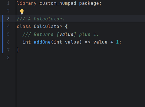
Initially, your file inside the lib folder contains this code snippet:
library package_guide;

/// A Calculator.
class Calculator {
/// Returns [value] plus 1.
int addOne(int value) => value + 1;
}
This code snippet is what you will see when you open your main file for the first time, where there is a class named Calculator that returns the value by incrementing it by 1.
3.2: Updating Project Structure
At this step, we will update the project structure as I have explained below:
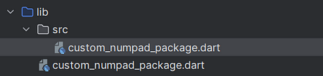
You have to create a folder inside the lib folder and name it “src” and create or copy the main code file, which is inside the lib folder inside the src folder with the same name.
Your lib folder should look like this:
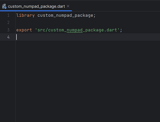
Now, in the file that is inside the lib folder (not inside the src folder), remove the calculator class and write:
export ‘src/[YOUR FILE NAME HERE].dart’;
For example, in my case, I have written export’src/custom_numpad_package.dart’. Now, go to your other file, which is inside the src folder, and write the code there.
After this step, your files should look like this:
lib/custom_numpad_package.dart
lib/src/custom_numpad_package.dart
3.3: Writing the code for your package
Now get inside your src folder, open the .dart file, remove the calculator class if it exists, and start writing your code for your personalized package.
Note that the name of the class should be your package name, so that developers can include your package in their code with the package name. If you want to make it customizable, you define the parameters on which you will make it customizable as instance variables, and you can make them required or optional in the constructor parameter.
For example:
class CustomNumPad extends StatefulWidget {
final double buttonHeight;
const CustomNumPad({Key? key, this.buttonHeight = 80}): super(key: key);
}
Here, you can see that I have named my class CustomNumPad. It has an instance variable called buttonHeight, which I have initialized inside my contructor parameter as 80, which means it is an optional field for the user if they want to give the height of the button manually or not. If they call this variable and give the height of the button as 100, then this value will override the previous value, and the height will be set to 100. You can make this required as well.
So, I am not going to skip over the technical details and presume that you are already comfortable with Dart coding and that you can create classes and UI in Flutter. For your reference, I have included my code below.
//Github @TheScriptRailoth
/// A customizable numeric pad widget for Flutter applications.
/// This widget allows users to create a numeric pad interface with customizable button dimensions, colors, and text styles, along with a text controller for input.
import 'package:flutter/material.dart';

class CustomNumPad extends StatefulWidget {
  ///The height of each numeric pad button.
  final double buttonHeight;

  ///The width of the numeric pad button.
  final double buttonWidth;

  ///Spacing between rows of buttons in numeric pad.
  final double rowSpacing;

  ///Spacing between columns of buttons in the numeric pad.
  final double columnSpacing;

  ///The button radius for each numeric pad button.
  final double buttonRadius;

  ///The background color of numeric pad buttons.
  final Color buttonColor;

  ///The background color of numeric pad.
  final Color bgColor;

  ///The corner radius of entire numeric pad.
  final double cornerRadius;

  ///The border size of numeric pad buttons.
  final double buttonBorder;

  ///The border's color of numeric pad buttons.
  final Color buttonBorderColor;

  ///The controller that manages the input text field.
  final TextEditingController? controller;

  ///The text style applied to the numeric pad buttons.
  final TextStyle buttonTextStyle;

  /// Creates a [CustomNumPad] widget.
  /// Creates a [CustomNumPad] widget with customizable parameters.
  ///
  /// [buttonHeight] sets the height of each button in the numeric pad. The default value is 80.
  ///
  /// [buttonWidth] sets the width of each button in the numeric pad. The default value is 95.
  ///
  /// [rowSpacing] determines the vertical spacing between rows of buttons. The default value is 5.
  ///
  /// [columnSpacing] determines the horizontal spacing between columns of buttons. The default value is 5.
  ///
  /// [controller] is the text controller managing the input field. It's optional.
  ///
  /// [cornerRadius] sets the corner radius of the numeric pad. The default value is 0.0.
  ///
  /// [bgColor] defines the background color of the numeric pad. The default is Colors.transparent.
  ///
  /// [buttonRadius] is the corner radius of each button in the numeric pad. The default value is 17.
  ///
  /// [buttonColor] is the background color of the numeric pad buttons. The default value is Color(0xffF5F6FA).
  ///
  /// [buttonTextStyle] defines the text style applied to the numeric pad buttons. The default style is bold, size 24, with the color set to Color(0xff005E54).
  const CustomNumPad({
    Key? key,
    this.buttonHeight = 80,
    this.buttonWidth = 95,
    this.rowSpacing = 5,
    this.columnSpacing = 5,
    //required this.controller,
    this.controller,
    this.cornerRadius = 0.0,
    this.bgColor = Colors.transparent,
    this.buttonRadius = 17,
    this.buttonColor = const Color(0xffF5F6FA),
    this.buttonBorder = 0.0,
    this.buttonBorderColor = Colors.transparent,
    this.buttonTextStyle = const TextStyle(
        fontWeight: FontWeight.bold,
        fontSize: 24,
        color: Color(0xff005E54),
        fontFamily: null),
  }) : super(key: key);

  @override
  State<CustomNumPad> createState() => _CustomNumPadState();
}

///This class manages the state of the CustomNumPad widget.
class _CustomNumPadState extends State<CustomNumPad> {
  @override
  Widget build(BuildContext context) {
    //Padding around entire widget
    return Padding(
        padding: const EdgeInsets.all(20.0),
        child: Center(
          child: Container(
            //Setting the size and appearance of the numeric pad
            height: (widget.rowSpacing * 3) + (widget.buttonHeight * 4),
            width: (widget.columnSpacing * 3) + (widget.buttonWidth * 3),
            decoration: BoxDecoration(
              color: widget.bgColor,
              borderRadius: BorderRadius.circular(widget.cornerRadius),
            ),
            child: Column(
              mainAxisAlignment: MainAxisAlignment.spaceBetween,
              children: [
                //Rows of numeric pad button
                Row(
                  mainAxisAlignment: MainAxisAlignment.spaceBetween,
                  children: [
                    _buildButton(1), // Creating a button for number 1
                    SizedBox(
                      width: widget.columnSpacing,
                    ),
                    _buildButton(2), // Creating a button for number 2
                    SizedBox(
                      width: widget.columnSpacing,
                    ),
                    _buildButton(3), // Creating a button for number 3
                  ],
                ),
                SizedBox(
                  height: widget.rowSpacing,
                ), // Space between rows of buttons
                Row(
                  mainAxisAlignment: MainAxisAlignment.spaceBetween,
                  children: [
                    _buildButton(4), // Creating a button for number 4
                    SizedBox(
                      width: widget.columnSpacing,
                    ),
                    _buildButton(5), // Creating a button for number 5
                    SizedBox(
                      width: widget.columnSpacing,
                    ),
                    _buildButton(6), // Creating a button for number 6
                  ],
                ),
                SizedBox(
                  height: widget.rowSpacing,
                ), // Space between rows of buttons
                Row(
                  mainAxisAlignment: MainAxisAlignment.spaceBetween,
                  children: [
                    _buildButton(7), // Creating button for number 7
                    SizedBox(
                      width: widget.columnSpacing,
                    ),
                    _buildButton(8), // Creating button for number 8
                    SizedBox(
                      width: widget.columnSpacing,
                    ),
                    _buildButton(9), // Creating button for number 9
                  ],
                ),
                SizedBox(
                  height: widget.rowSpacing,
                ), // Space between rows of buttons
                //Special buttons (dot, zero, backspace)
                Row(
                  mainAxisAlignment: MainAxisAlignment.spaceBetween,
                  children: [
                    Container(
                      height: widget.buttonHeight,
                      width: widget.buttonWidth,
                      decoration: BoxDecoration(
                          color: widget.buttonColor,
                          borderRadius:
                              BorderRadius.circular(widget.buttonRadius),
                          border: Border.all(
                              width: widget.buttonBorder,
                              color: widget.buttonBorderColor)),
                      child: ClipRRect(
                        borderRadius:
                            BorderRadius.circular(widget.buttonRadius),
                        child: TextButton(
                          onPressed: () {
                            widget.controller?.text += '.';
                          },
                          child: Text(
                            '.',
                            style: TextStyle(
                              fontWeight: widget.buttonTextStyle.fontWeight,
                              fontSize: (widget.buttonTextStyle.fontSize)! + 15,
                              color: widget.buttonTextStyle.color,
                            ),
                            textAlign: TextAlign.center,
                          ),
                        ),
                      ),
                    ), //Dot Button
                    SizedBox(
                      width: widget.columnSpacing,
                    ),
                    Container(
                      height: widget.buttonHeight,
                      width: widget.buttonWidth,
                      decoration: BoxDecoration(
                          color: widget.buttonColor,
                          borderRadius:
                              BorderRadius.circular(widget.buttonRadius),
                          border: Border.all(
                              width: widget.buttonBorder,
                              color: widget.buttonBorderColor)),
                      child: ClipRRect(
                        borderRadius:
                            BorderRadius.circular(widget.buttonRadius),
                        child: TextButton(
                          onPressed: () {
                            widget.controller?.text += '0';
                          },
                          child: Text(
                            '0',
                            style: TextStyle(
                              fontWeight: widget.buttonTextStyle.fontWeight,
                              fontSize: widget.buttonTextStyle.fontSize,
                              color: widget.buttonTextStyle.color,
                            ),
                            textAlign: TextAlign.center,
                          ),
                        ),
                      ),
                    ), //Zero Button
                    SizedBox(
                      width: widget.columnSpacing,
                    ),
                    Container(
                      height: widget.buttonHeight,
                      width: widget.buttonWidth,
                      decoration: BoxDecoration(
                          color: widget.buttonColor,
                          borderRadius:
                              BorderRadius.circular(widget.buttonRadius),
                          border: Border.all(
                              color: widget.buttonBorderColor,
                              width: widget.buttonBorder)),
                      child: ClipRRect(
                        borderRadius:
                            BorderRadius.circular(widget.buttonRadius),
                        child: TextButton(
                          onPressed: () {
                            if (widget.controller!.text.isNotEmpty) {
                              final String xyz = widget.controller!.text
                                  .substring(
                                      0, widget.controller!.text.length - 1);
                              widget.controller?.text = xyz;
                            }
                          },
                          child: Icon(
                            Icons.backspace_outlined,
                            color: widget.buttonTextStyle.color,
                            size: widget.buttonTextStyle.fontSize! + 5,
                          ),
                        ),
                      ),
                    ) //Backspace button
                  ],
                ),
              ],
            ),
          ),
        ));
  }

  //Helper method to create numeric buttons
  Widget _buildButton(int number) {
    return Container(
      height: widget.buttonHeight, //Sets the height of the button
      width: widget.buttonWidth, // Sets the width of the button
      decoration: BoxDecoration(
          color: widget.buttonColor, // Sets the button's background color
          borderRadius: BorderRadius.circular(
              widget.buttonRadius), //Rounds the button corners
          border: Border.all(
              width: widget.buttonBorder, color: widget.buttonBorderColor)),
      child: ClipRRect(
        borderRadius: BorderRadius.circular(widget.buttonRadius),
        child: TextButton(
          onPressed: () {
            //Appends the tapped number to the controller's text
            widget.controller?.text += number.toString();
          },
          child: Text(
            number.toString(),
            style: TextStyle(
              //Displays the number on the screen
              color: widget.buttonTextStyle.color, // Sets the text color
              fontSize:
                  widget.buttonTextStyle.fontSize, // Sets the text font size
              fontWeight: widget
                  .buttonTextStyle.fontWeight, // Sets the text font weight
              fontFamily: widget
                  .buttonTextStyle.fontFamily, // Sets the text font family
            ),
            textAlign: TextAlign.center,
          ), // Aligns the text to the center of the button
        ),
      ),
    );
  }
}
@TheScriptRailoth
Step 4: Publish the project on Github.
Publish your project on Github and make the repository public. You can use the following commands to publish it on Github:
git init
git add .
git commit -m “Initial commit”
git remote add origin <repository_url>
git push -u origin master
Step 5: Update the Pubspec.yaml
In this step, we have to update our Pubspec.yaml and add some required fields, like description, homepage, and repository.
Description: Add a description of your package in a single line; it should not be too long or too short.
homepage: Add the link to your github repository. But remove it .git from last.
Wrong url:
https://github.com/TheScriptRailoth/package-custom_numpad.git
Correct url:
https://github.com/TheScriptRailoth/package-custom_numpad
version: Add the current version of your package. You can start with 0.0.0 or 0.0.1.
name: custom_numeric_pad
description: Custom Numeric Pad integrates customizable numeric keypads for payment and inputs.
version: 0.0.5
homepage: https://github.com/TheScriptRailoth/package-custom_numpad
Step 6: Add documentation to your code.
To provide documentation for your code, you can use /// for a specific class, object, or method.
You have to specifically write comments in your code file about every variable or function that you have used and why you have used them.
Alternatively, you can use this command at the package location in the command prompt to have the documentation added to your code automatically.
dartdoc
Step 7: Create a changelog file.
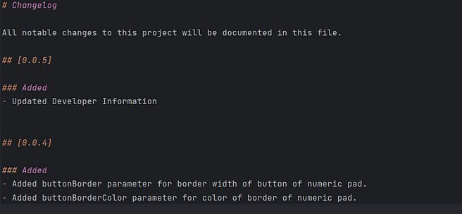
You have to create a CHANGELOG.md file in your project folder, which will contain a description of the changes you have made to every version in descending order. For example:
# Changelog

All notable changes to this project will be documented in this file.

## [1.0.0] — 05/02/2024
### Added
- Updated Developer Information
You can use this format to write your change log file, and you can stack this with your next changes.
CHANGELOG.dart
Step 8: Creating a License
Getting a license for your code is more than just a formality; it is an essential first step in defining the conditions under which your creation can be used and contributed to. A license is your digital signature, stating who owns the content and laying out the guidelines for using your code.
To get started, choose a license that fits the spirit of your project, make a LICENSE.txt file, and include it in your project documentation.
For more information on which license you have to use, you can visit the below website and use any license you want. I personally used the MIT license.
Here is the template for the MIT License:
MIT License Copyright © [year] [fullname] Permission is hereby granted,
free of charge, to any person obtaining a copy of this software and associated
documentation files (the “Software”), to deal in the Software without
restriction, including without limitation the rights to use, copy, modify,
merge, publish, distribute, sublicense, and/or sell copies of the Software,
and to permit persons to whom the Software is furnished to do so, subject to
the following conditions: The above copyright notice and this permission
notice shall be included in all copies or substantial portions of the Software.
THE SOFTWARE IS PROVIDED “AS IS”, WITHOUT WARRANTY OF ANY KIND, EXPRESS OR
IMPLIED, INCLUDING BUT NOT LIMITED TO THE WARRANTIES OF MERCHANTABILITY,
FITNESS FOR A PARTICULAR PURPOSE AND NONINFRINGEMENT. IN NO EVENT SHALL THE
AUTHORS OR COPYRIGHT HOLDERS BE LIABLE FOR ANY CLAIM, DAMAGES OR OTHER
LIABILITY, WHETHER IN AN ACTION OF CONTRACT, TORT OR OTHERWISE, ARISING FROM,
OUT OF OR IN CONNECTION WITH THE SOFTWARE OR THE USE OR OTHER DEALINGS IN THE
SOFTWARE.
Step 9: Create an Example
Inside your package folder, you have to create a new Flutter project named example, which will contain the implementation example of your package. So, don’t modify the project name; just keep the example.
You can do this by simply creating a Flutter project named example and copying that project folder inside your package folder.
In that example Flutter project, you have to implement your package and show how a user can use it. As you must know, we have to add a dependency to any package in the pudspec.yaml file before using it. So, to add the dependency, you can use the package name, and for the path, you can add the complete path of your folder on your PC or just write the name of the package with the current version.
package_name:
path: Complete path of the package on your computer.
Here is an example of how we can write our main.dart, for example:
import 'package:custom_numeric_pad/custom_numpad_package.dart';
import 'package:flutter/material.dart';

void main() {
  runApp(MyApp());
}

class MyApp extends StatelessWidget {
  @override
  Widget build(BuildContext context) {
    return MaterialApp(
      home: ExamplePage(),
    );
  }
}

class ExamplePage extends StatefulWidget {
  @override
  _ExamplePageState createState() => _ExamplePageState();
}

class _ExamplePageState extends State<ExamplePage> {
  late TextEditingController _controller;

  @override
  void initState() {
    super.initState();
    _controller = TextEditingController();
  }

  @override
  void dispose() {
    _controller.dispose();
    super.dispose();
  }

  @override
  Widget build(BuildContext context) {
    return Scaffold(
      appBar: AppBar(
        title: const Text('Custom NumPad Example'),
      ),
      body: Padding(
        padding: const EdgeInsets.all(20.0),
        child: Column(
          mainAxisAlignment: MainAxisAlignment.center,
          children: [
            const SizedBox(height: 30,),
            TextFormField(
              style: const TextStyle(
                fontSize: 30
              ),
              controller: _controller,
            ),
            SizedBox(height: 10,),
            CustomNumPad(
              controller: _controller,
              buttonHeight: 80,
              buttonWidth: 95,
            ),
          ],
        ),
      ),
    );
  }
}
Step 9: Push all the changes to your GitHub repository.
You now need to add all of this to your Github repository.
Step 10: Create an account on Pub.dev.
Go to https://pub.dev/ and create your profile by which you want to publish this package.
Step 11: Test your package.
Now that we are on the second step, you now have to test your package to see if it is working fine or not.
Run this command on the terminal:
flutter pub publish — dry-run
Make the necessary adjustments if any recommendations or warnings are found.
Step 12: PUBLISH YOUR PACKAGE
Soooo!!! It’s time to publish your first ever package on pub.dev.
Just run this:
flutter pub publish
Andddd yeahh!! Congratulations 🎉!! You have successfully published your package on pub.dev!
When you make changes to your Flutter package now, you should make sure that everything is properly documented. You should make sure that the version number in the Pubspec.yaml file is updated to accurately reflect any modifications. You should also keep a detailed log of these changes in the CHANGELOG.md file.
That’s all from my side. If you need any help, you can connect with me at am3718440@gmail.com.
Happy Coding! Keep Fluttering 💙!!
— Ashutosh Mishra